Components
Components are the building blocks of a screen. You add them from the component tree, arrange them on the canvas, and configure each one in the right-hand settings panel.
Each component has three tabs in the settings panel:
- Settings — what the component does and the data it uses.
- Styles — its appearance (size, spacing, colours, alignment).
- Conditions — rules that show, hide, or update the component based on bindings.
Layout
Layout components group and position everything else: Container, Section and Layout arrange their children, Divider adds a horizontal separator, Tag shows a small label, while Side Panel and Modal reveal content on demand (most often create/edit forms — see the Forms example below).
Display
Display components present static or bound content: Headline, Paragraph and Text for copy, Image and Background Image for pictures, Icon for icons, Markdown Viewer for rich text, Embed for external HTML or an iframe, and the Vertical Card, Horizontal Card and Stat Card for showing a record as a card.
The app navigation is provided by the Nav Bar, configured per app — see Navigation.
Data
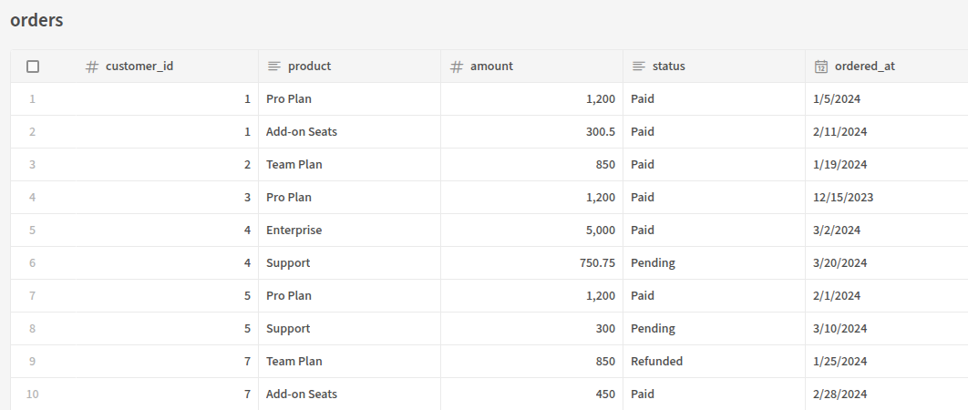
Data components fetch and render rows. A Data Provider (or Single Row Provider) fetches data from a table or query and passes it to child components, a Repeater renders its children once per row, and the Table displays rows in a sortable, selectable grid. Stacked List, Gallery, Cards Block and Row Explorer Block are higher-level ways to browse collections.
For example, a Table bound to a SQL table renders its rows directly in the app:
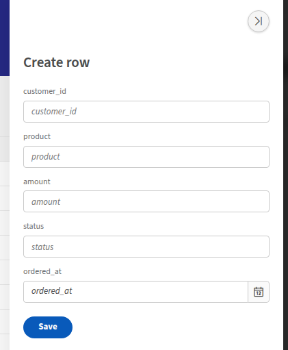
Forms and fields
A Form or Form Block collects input and writes it back to your database or an API — see Forms. A Multi-step Form Block splits a form across steps, and a Field Group groups related fields. The available field components are Text, Long Form, Number, BigInt, Checkbox, Date Picker, Date Range, Options Picker, Multi-select Picker, Relationship Picker, User / User List, Email, URL, Password, JSON, Rating, and File Upload.
Here a Form sits inside a Side Panel to create a new row:
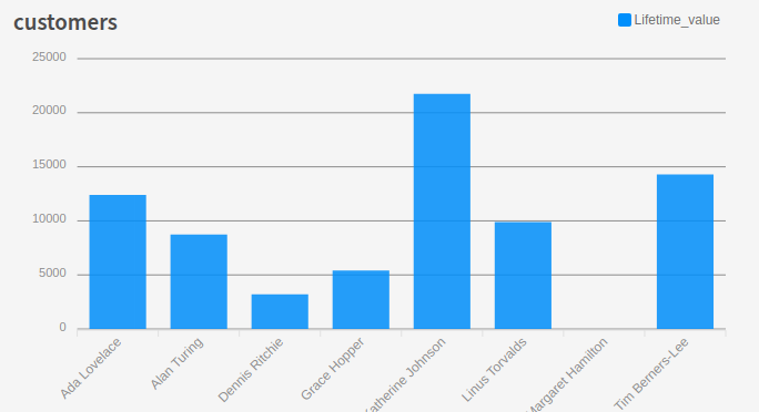
Charts
Chart components visualise your data as Bar, Line, Area, Pie, Donut, Histogram or Candlestick charts. The Chart Block wires a chart to a data source with just a label column and one or more data columns:
Navigation and actions
Buttons and Button groups trigger actions such as navigating, saving rows, or opening modals, and the Link component navigates to another screen or URL.
Blocks
Components ending in Block (Form Block, Table Block, Cards Block, Chart Block, Repeater Block, Gallery, Row Explorer Block) are higher-level, pre-assembled components. They bundle several components together for common patterns so you can add a working feature in one step, then customise it.
Actions
Many components — especially Buttons and Forms — can run actions in response to an event such as a click or a successful save. See Actions for the full list of available actions and how to chain them.