Apps
The Apps section is the app builder, where you design the screens your end users interact with. Apps are single-page applications backed by your SQL tables and APIs.
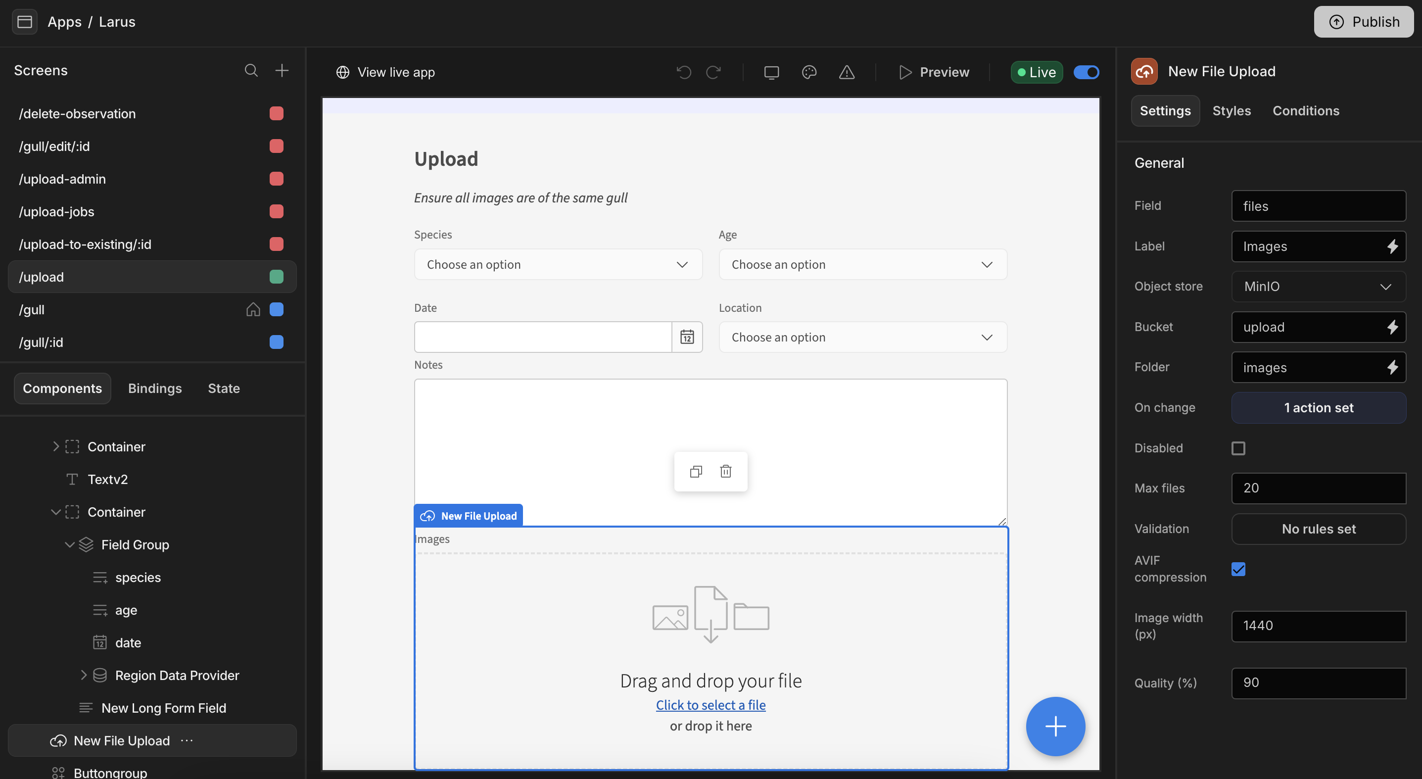
The app builder layout
| Area | Purpose |
|---|---|
| Screens panel (left) | Lists every screen in the app. Each screen shows the minimum role required to access it. |
| Component tree (left) | The hierarchy of components on the selected screen. Switch between Components, Bindings, and State. |
| Canvas (centre) | A live preview of the current screen. Select components here to edit them. |
| Settings panel (right) | Configure the selected component via the Settings, Styles, and Conditions tabs. |
Building an app
A typical flow looks like this:
- Add screens — blank, or autogenerated from a table.
- Add components — tables, forms, charts, text, and more.
- Bind data — wire components to tables, queries, and state.
- Theme — adjust the look and feel.
- Set up navigation — links and menus between screens.
- Publish — make the app live for your end users.
Preview and live apps
The builder toolbar lets you:
- Preview the app in a new tab as an end user would see it.
- Toggle a screen or app Live to publish it.
- View live app to open the published version.
- Switch between desktop/mobile preview, change the theme, and check for warnings.
Generating an app from data
To get started quickly, use Generate (available from a table in the SQL tables section) to automatically create screens for viewing and managing that table's data. You can then customise the generated screens like any other.